Low Vision: mobile adaption on iPhone

A thing that is often forgotten by people who don’t directly work in accessibility is that computer accessibility isn’t just about blind folk using screen readers. There’s a wild and wacky world of many varying and intersecting disabilities: no vision, low vision, deafness, hardness of hearing, cognitive problems, difficulty with fine motor control, language skills, and any number of others.
And for most of these there are wide ranges in degree. For example some “low vision” users can see a few words at most on a large display. And then there are those like myself who can see a fair bit on a single screen but it does have to be large and high-contrast.
Even with this level of vision it can be quite difficult and frustrating to use a mobile device, because even where the operating system developers have made a good effort to build in the ability to tweak and customise the experience as best suits the individual user, many third-party app developers completely ignore those settings.
System level options
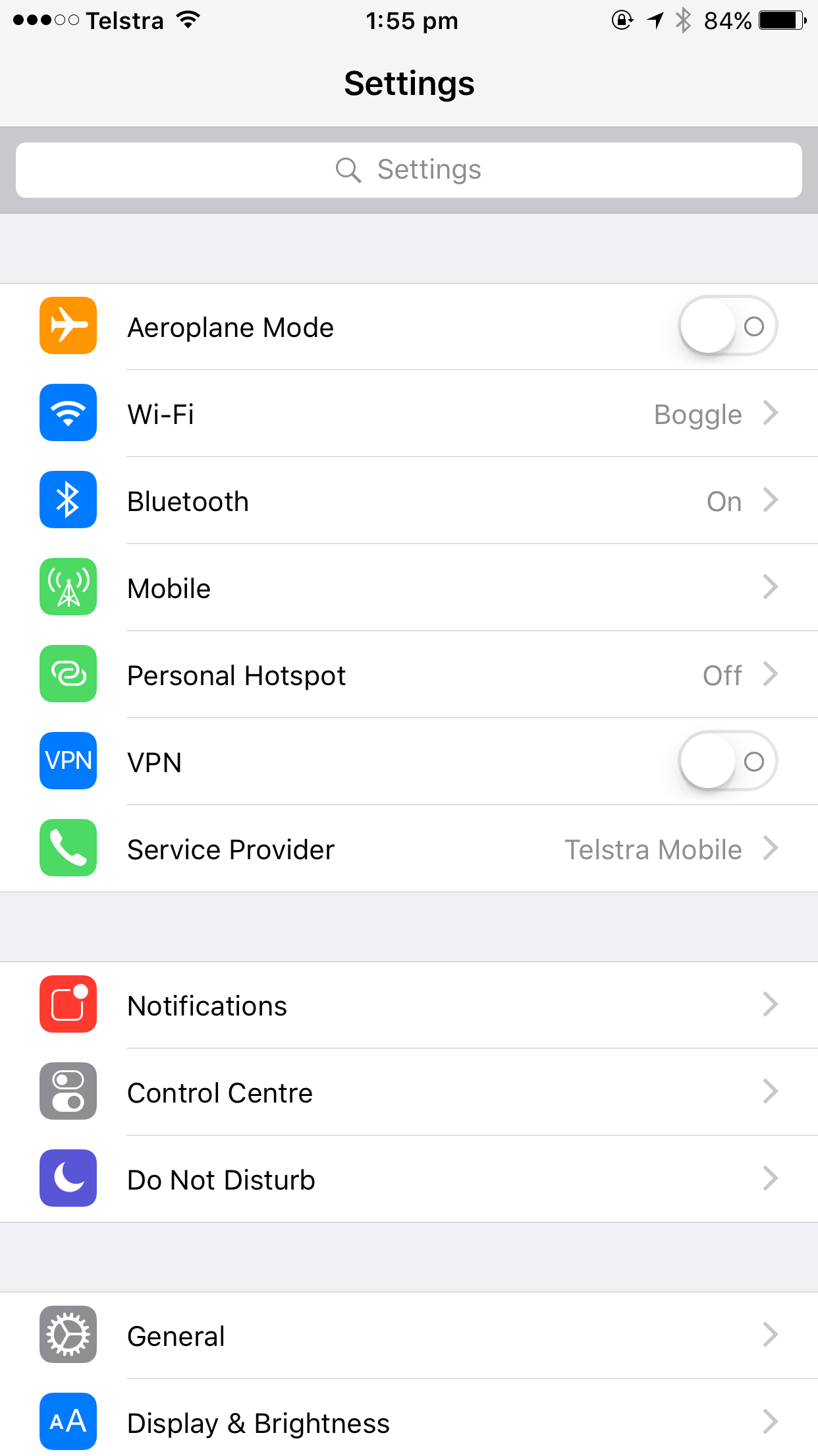
Here’s what the iPhone’s setting screen looks like by default:
And here’s what it looks like when I’m done configuring the phone so I can use it comfortably!
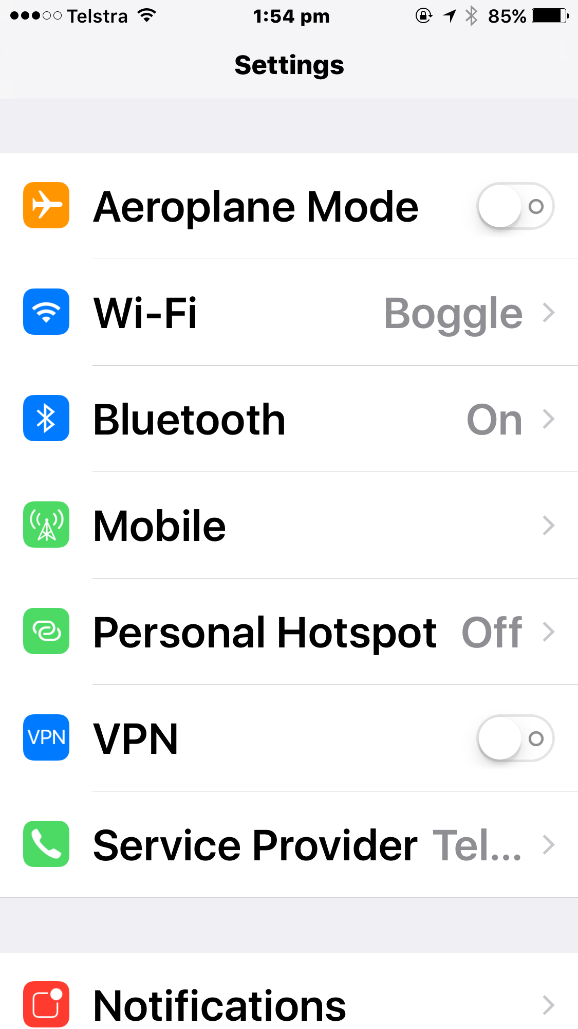
Quite the difference, eh?
There’s a lot less information on a single screen, but the flip side of that is that what information is there is readable even with my quite poor eyesight.
Most of Apple’s built-in apps support this “dynamic text” feature. Mail and Calendar, for example.
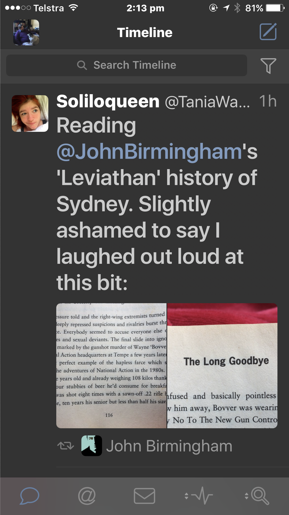
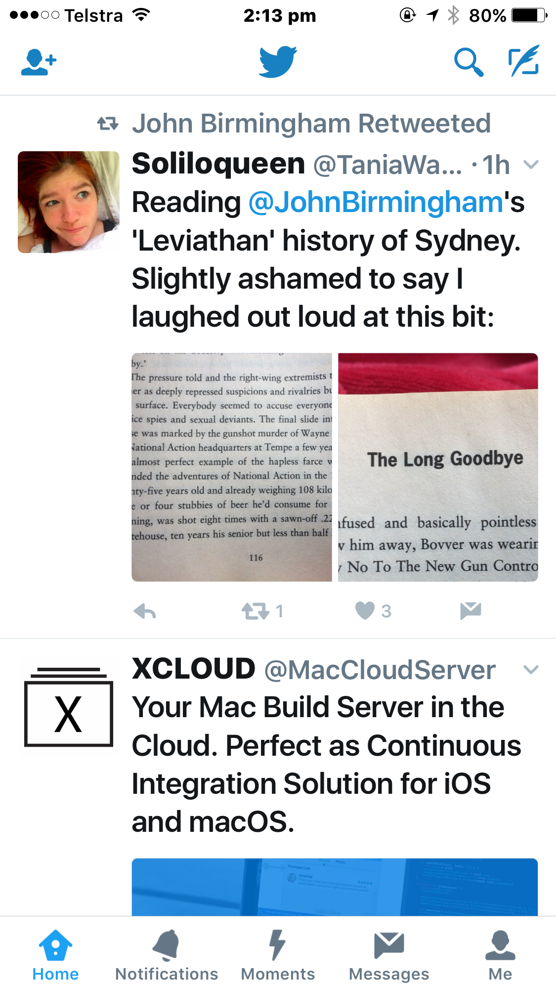
Some third-party apps also honour it. Tweetbot, my preferred Twitter client, does a really great job:
Compare this to the official Twitter app, which seems to be paying attention to the “bold text” option but ignoring dynamic text in favour of its own preference settings. Here it is at the largest available size:
Even more apps both ignore the text size and weight options set at the system level and have no options for changing the display. Facebook applies the weight, but not the size. The food delivery apps UberEATS, Deliveroo, and Menulog all ignore both. Airbnb, Stayz, and Realestate.com.au likewise. Pretty much every dating app I have ever tried to use.
When text can’t be made larger…
iOS offers a magnifier which works fairly well. It’s had an annoying bug since iOS 10.0 where it doesn’t immediately magnify the area under the “lens” – you have to move the lens first, and then the magnification kicks in – but otherwise it is best-in-class.
There’s an option to select what happens when you triple-click the home button. This can turn on a variety of accessibility features, or it can present an accessibility menu to allow the specific tool you need to be turned on or off. I have it set to start or stop the magnifier in “lens” mode.
In this mode a box appears on the screen. Content within the box is magnified, that without is not. The box can be moved around with your finger.
There’d be a photo of this here but unfortunately the screen shot tool on the iPhone can’t show this!
It’s not ideal to use for anything more than short periods as of course the text on screen isn’t re-flowing to fit the new size, so instead you have to move the box side to side and up and down to hover over the area being read. But it’s a good workaround for when developers have ignored the text size problem.
Browsing the web
In most other respects Android is in a similar, or close-enough, place to iOS. But this is one place where Apple is out ahead and there doesn’t seem much prospect of Google doing anything about it.
Safari has a lovely option called “reader mode”. You’ve probably seen the little icon in the URL bar at the top of the Safari screen after a page has loaded:
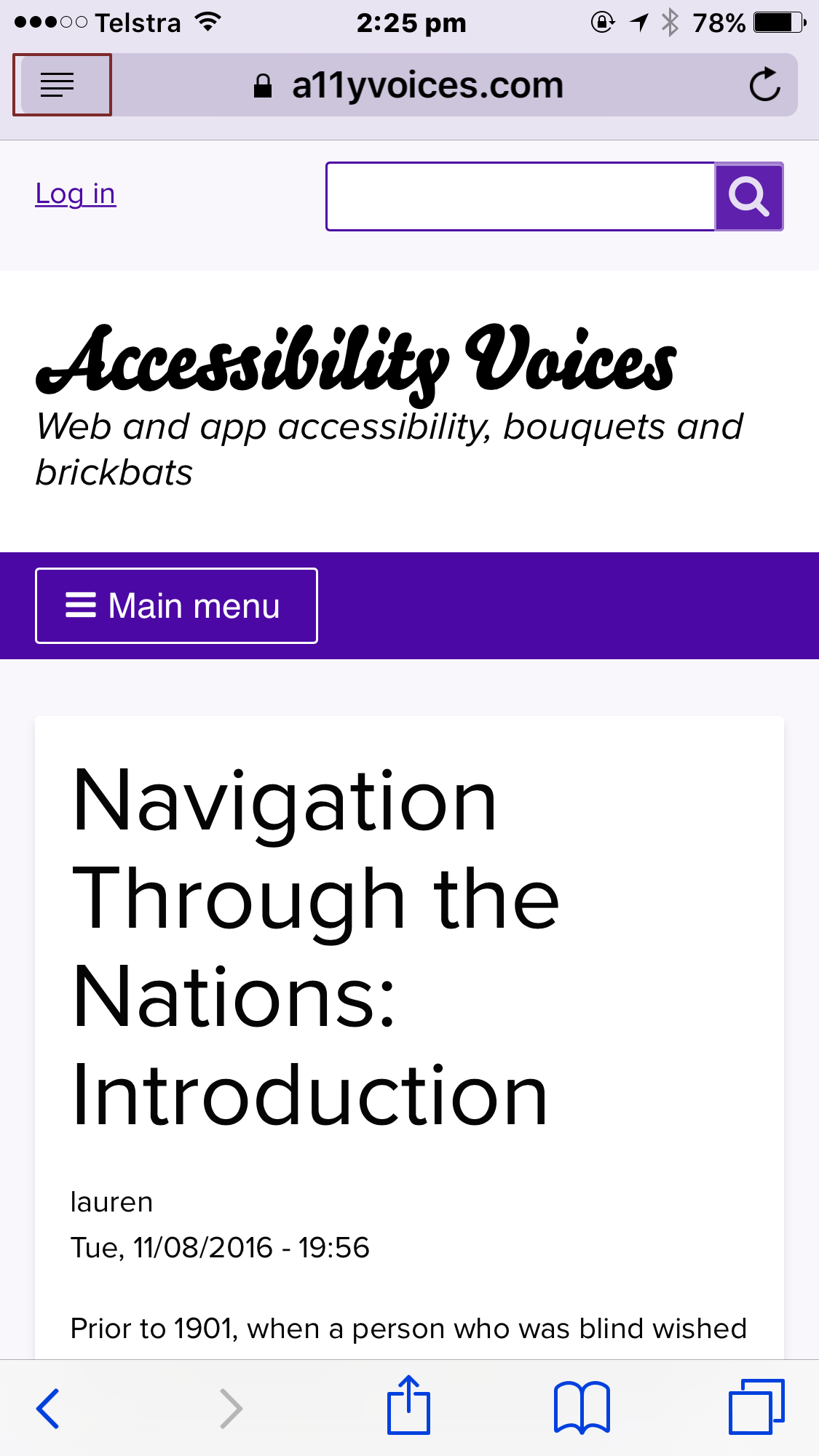
When it’s available Safari will even briefly show the text “Reader mode available” in the URL bar as the page loads.
When this is tapped, the page shown above becomes – with the specific options I have set for comfortable reading – this:
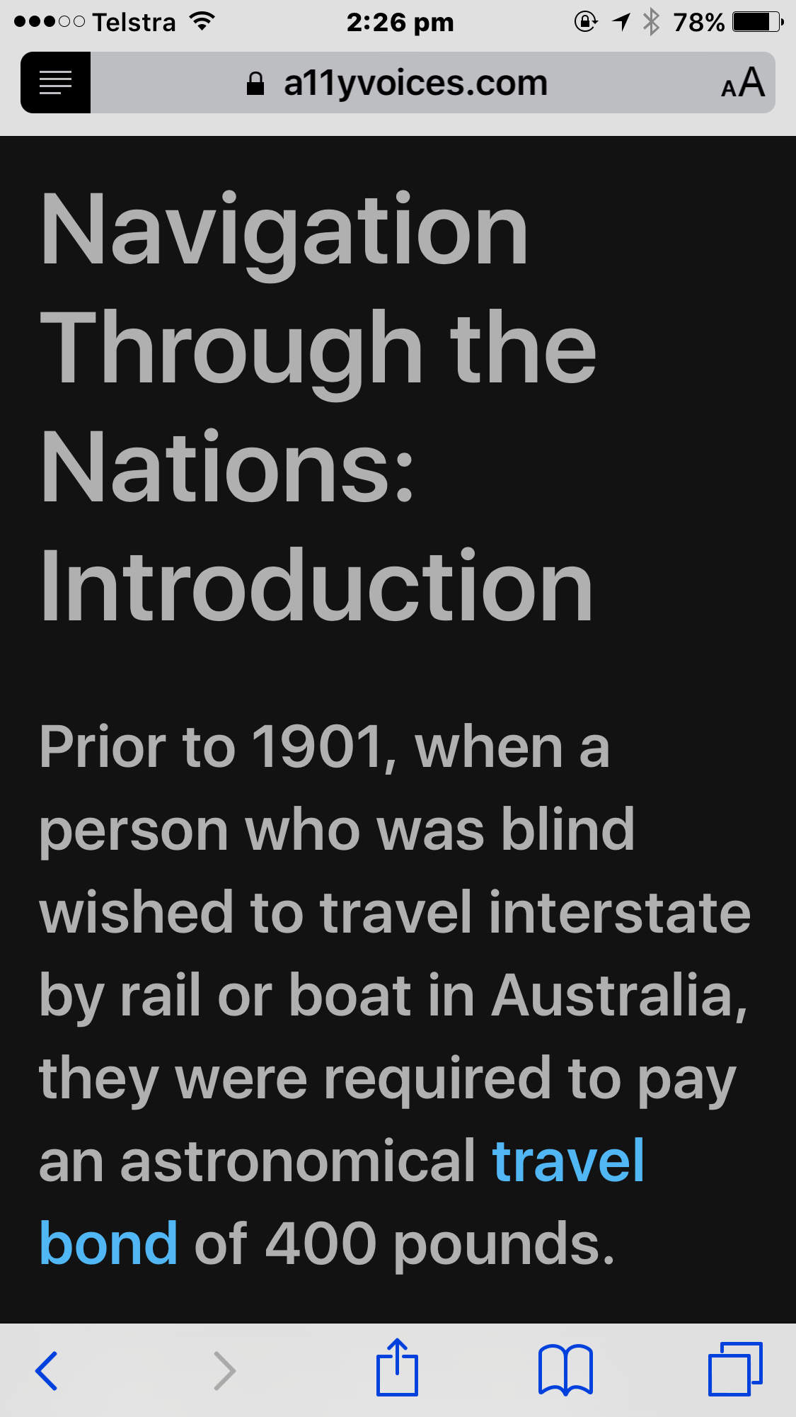
The text doesn’t have to be this size. By default it’s quite a bit smaller. It can also be larger. The background can be one of four colours, and there are eight fonts to choose from. The equivalent on Firefox for desktop has more options, but this does very nicely indeed.
Here’s the inevitable “but”: many web sites do things that make this not work, on at least some pages. This seems to be most common with some forms of Twitter embed. It’s particularly annoying when it happens. So the approach isn’t perfect.
Why isn’t in Chrome on Android? My best guess – perhaps a bit cynical – is that one side-effect of a feature like this is that you also aren’t seeing the ads. And guess how Google makes its money?
In conclusion…
I hope this has been useful for those of you wondering how a low-vision user adapts a smartphone to their needs. Different people will need different adaptations to different degrees, but broadly it comes down to “make the things bigger”. And it is intensely frustrating when app developers don’t consider this.
If you’re a developer, please try to use the dynamic type features supported by the platform. Android and iOS both have these features. And if you’re going to insist on instead having your own font-size options don’t limit that unreasonably: take what you think is a reasonable maximum and then add at least 50%, if not more!
Add new comment