Task Management: the Trello Experience
As this is my first post, I should introduce myself. My name is Lauren Hayes and I am the PA at AccessibilityOz. I've been in the role for a couple of months now, and like anyone starting a new job, I've experienced the anxiety that comes with it - will I be able to get my head around new processes and procedures? What will my colleagues be like? In addition to this, starting a new job can be complicated further by accessibility issues. As an employee who happens to be blind, I use screen reading software, which enables me to use a computer effectively ... most of the time.
Here at AccessibilityOz, we use a lot of cloud-based software to complete our work. So far, some of it has been quite accessible, but not everything.
Over the next few weeks, I will be writing a series of blog posts on my experience using various online platforms, starting with Trello.
What is Trello?
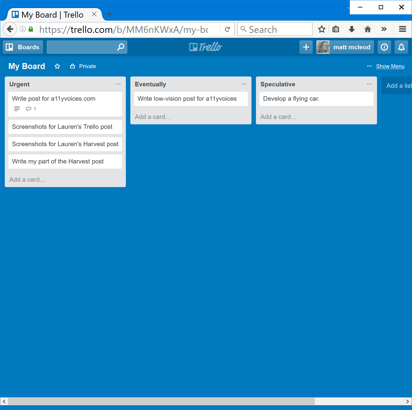
For the uninitiated, Trello is a task management system where tasks can be allocated to individual members or groups. The administrator can assign posts to created categories, for example, “daily”, “weekly”, “monthly”, or "as time allows”. Tasks may include things like “book flights”, “research insurance companies” or “update the contacts database”
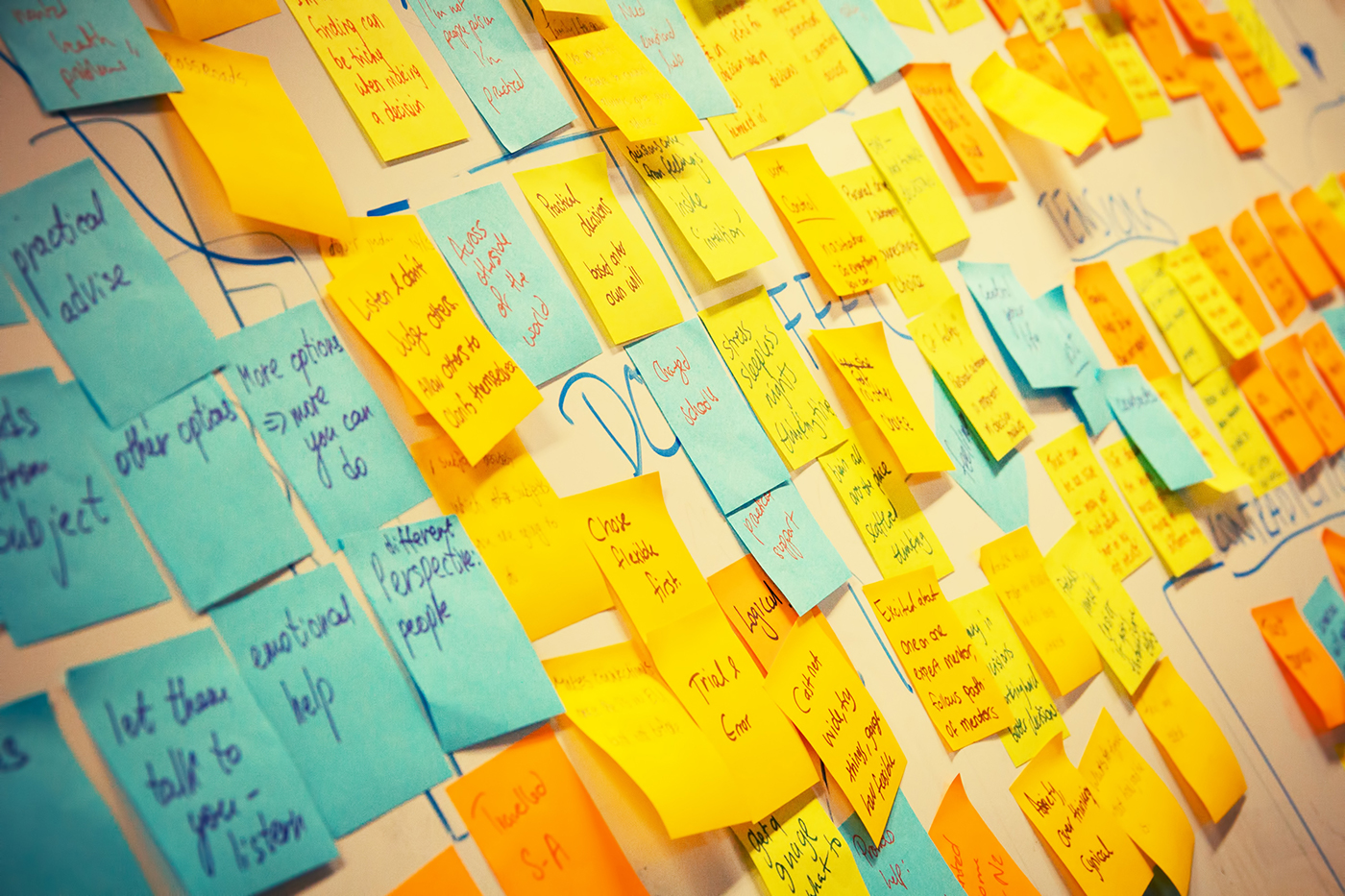
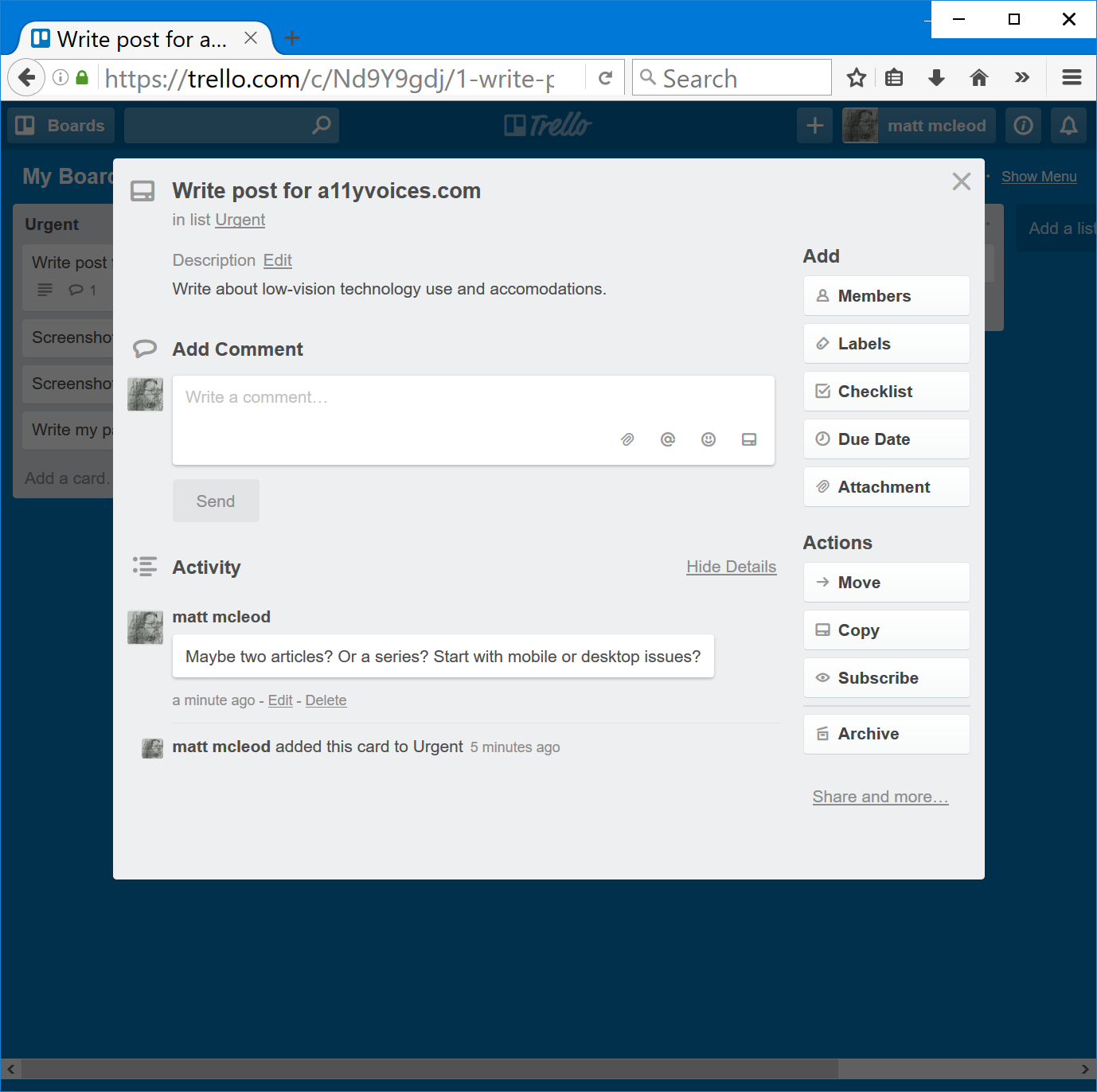
When a particular task is opened, the user can read any descriptions provided, and add comments relating to the task. This allows the creator of the task to monitor its completion, and to interact with colleagues regarding a task's progress. Think of it like an electronic version of an office noticeboard with post-it notes.
This all seems fairly straightforward, and it is, if you can see. But for those of us using screen readers, sussing out Trello will require several coffee breaks and a picnic lunch.
Trello and Web Browsers
When using Trello with JAWS and Firefox, the homepage and login screens are quite straightforward. After logging in, the interface isn’t quite so intuitive. When arrowing down from the top of the screen, I encountered the following inaccessible features:
- An unlabelled edit field followed by a “clickable” option. My immediate assumption is that this could be a search field, but there is nothing to indicate whether or not this is the case.
- An unlabelled link, directly above the “new stuff” link
- When pressing control+end to navigate to the bottom of the page, I’m immediately placed in an edit field containing the word “done”. Tabbing away from this places me back at the top of the page.
The Trello board also contains some features which, in my personal opinion, have room for improvement.
The various categories containing the task cards are presented as edit fields. This is convenient if the category labels need to be edited, but it wasn’t initially obvious to me that they were simply categories under which tasks could be grouped. It would make more sense if they were under headings, with the option to edit them in the form of a link or a button. There is a lack of consistency in the way the categories are displayed, in that once a particular task is opened, the categories are then displayed as links.
When a task is viewed, it appears alongside other tasks and their associated comments and descriptions. There is no navigational heading associated with the relevant task, so it takes some time to find exactly what I am looking for. Practically, and in the interest of time, I believe it would make far more sense to only be able to see information relating to the task that has been opened.
The above-mentioned accessibility issues are also apparent when using the NVDA screen reader. Interestingly, when navigating to the end of the page, where JAWS puts the cursor in an edit field, NVDA reads a string of numbers and symbols instead.
Trello is slightly less clunky when used with Internet Explorer in comparison to Firefox. While the edit field on the homepage is still unlabelled, there are no unlabelled links or “clickable” options. Navigating to the end of the page no longer places me in an edit field, but the cursor is placed on the link to the “Getting Started” guide.
In the boards list, the categories appear in edit fields, as they did with Firefox, and are displayed as links once a task is viewed. Alongside the text links to each task, there is also another link which includes the task title as well as a string of symbols, numbers and letters. For example: rIV66RBU/1-add-clients-to-insightly#.
The aforementioned issues with viewing tasks using Firefox also occur with Internet Explorer.
For each task, there is an edit field for writing comments, underneath which are a list of links, followed by the “send” button. The labels for these links, which include options such as “add an attachment”, and “mention a member”, are not read when using Firefox, but are accessible with Internet Explorer.
Again, as with Firefox, similar issues arise when using NVDA, Trello and IE. It is also more laggy and less responsive than with Firefox.
The accessibility issues with Trello and Google Chrome are almost identical with Firefox, the main difference being that the task links are presented as clickable links rather than elements.
A Semi-Accessible Solution
After limited success using Trello with web browsers, I installed the iPhone app. I was pleasantly surprised to discover that it was far easier to work with than the web-based version. There are still some glitches, which I will list later, but first, here are just some of the app’s accessible features:
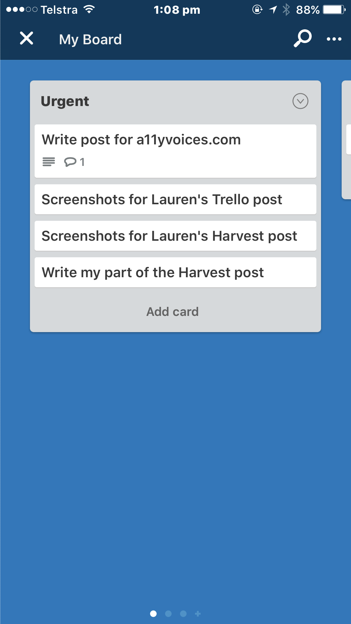
- Trello features such as the search function, accounts and notifications, are clearly labelled tabs at the bottom of the screen
- The boards are displayed as buttons
- The task categories are called lists, and are still editable, but only when double tapped to activate the editing options
- The tasks in each lists are labelled as cards, and are in the form of buttons which can be tapped to view further information
- Each category is listed on a separate page, and a three finger swipe to the left or right will navigate between pages
- When viewing each task, only information relevant to that particular task is displayed.
Inaccessible features:
- Navigating screens is straightforward when simply swiping from left to right, but it is difficult to determine where items are placed on the screen. This is particularly noticeable when looking at boards.
- When viewing tasks, a three finger swipe up or down will move between rows, but the app does not always respond well to this gesture. When it works, and if a finger is placed on a particular part of the screen, it is possible to read comments relating to the task.
Currently, Trello isn’t quite accessible enough for me to warrant using it as my primary task management system. However, I really like the concept of Trello, particularly when using the app, and I hope the developers will make accessibility improvements in future.
Add new comment