Confessions of a PA: the Complexities of Tracking Time

I’m not just talking about those moments when it’s late in the afternoon and your sugar and caffeine high is wearing off. You stare vaguely at the computer screen for what seems like an eternity - but it’s only been five minutes - trying to focus on writing a blog post. What I am talking about is Harvest, an online platform that allows you to keep track of your working hours. You use it to keep a record of how much time you spend on individual projects.
For the most part, I have been using Harvest with JAWS and Firefox. The Harvest homepage looks very promising. It is straightforward to navigate, with no accessibility issues, or none that are immediately obvious.
After signing in, the user’s homepage also looks promising. Links to the user account, projects, expenses, etc are clearly labelled, and a heading 1 displays the day and date currently selected. This is also read as a “clickable” item, but nothing happens when the user clicks using enter.
Next, we come across some clearly labelled buttons: previous day, today, next day, and change date. These buttons, along with a link to change to week view, are displayed in a banner, according to JAWS. Following this are links to each day of the week, labelled with the day’s initial, and the number of hours completed. According to Harvest, I’ve worked 0 hours as I’ve not been able to fill anything in as yet. No, I’ve not been getting paid to do nothing, which is just as well, given the famous quotes about time that appear next. Today, Gene Wilder as Willy Wonka is telling me that “time is a precious thing. Never waste it”.
While the quotes are cute and fun to read, they’re not helpful for understanding how to fill in a timesheet. Clicking the links to days of the week will change the current day displayed, but this wasn’t immediately obvious until I looked at the page using heading navigation.
Entering on the “New Entry” button offers some more options to work with. It shows some edit fields, such as “office” and “itinerary”, some of which are read when navigating by tab, or the E and Shift E commands to move between edit fields. The first and last edit fields are unlabelled.
I wasn’t entirely sure what, if anything, I was supposed to write in each field, so I started with the one labelled office, recording the time entry of 6:00. An error message was then displayed, saying that there were no matching results. After exploring further, it seemed that the time needed to be entered into the field labelled 0:00. However, I couldn’t see any fields to record start and finish times, or lunch breaks.
At this point, it seemed that the only way to get around this would be to use the Start Timer button, which automatically calculates your time.
Next, I decided to do the sensible thing and read the help pages – perhaps there was something I’d missed. I’ll confess that usually I’m one of these people who likes to dive right in and explore how something works, rather than reading instructions, but this approach has its disadvantages. I had expected Harvest to behave like an Excel spreadsheet, where start and end times are entered, and the total number of hours worked is then calculated. Harvest works by having the user manually enter the total duration of time spent on specific tasks. To record time for an entire work day, a task would need to be created for the user to record this information.
Using Harvest with NVDA offers a similar experience to JAWS. The only difference is that the edit fields in the time entries are not read when using tab or E for navigation. The labels can only be seen when navigating with arrow keys.
Similarly, with Internet Explorer, the way both NVDA and JAWS interact with the Harvest website are the same. Google Chrome is also the same, for the most part, but there are some small differences. In a new entry, all of the edit fields are read with labels using navigational commands, apart from the notes field, which says “contains text”. Underneath this field are a few lines of “clickable” text, which are labelled Non-Billable, Itinerary and Misc. This information was also shown in Internet Explorer and Firefox, but appeared above, rather than below the notes field.
Visually, these options are presented differently compared to using a screenreader. Completed timesheets also have a different visual layout, as my colleague Matt McLeod explains:
The Harvest experience for a sighted user
The experience for a sighted user is very different to that for a blind user relying on a screen reader. The tool is simple, the screen layouts straightforward and very easy to understand.
Here, for example, is the day view:
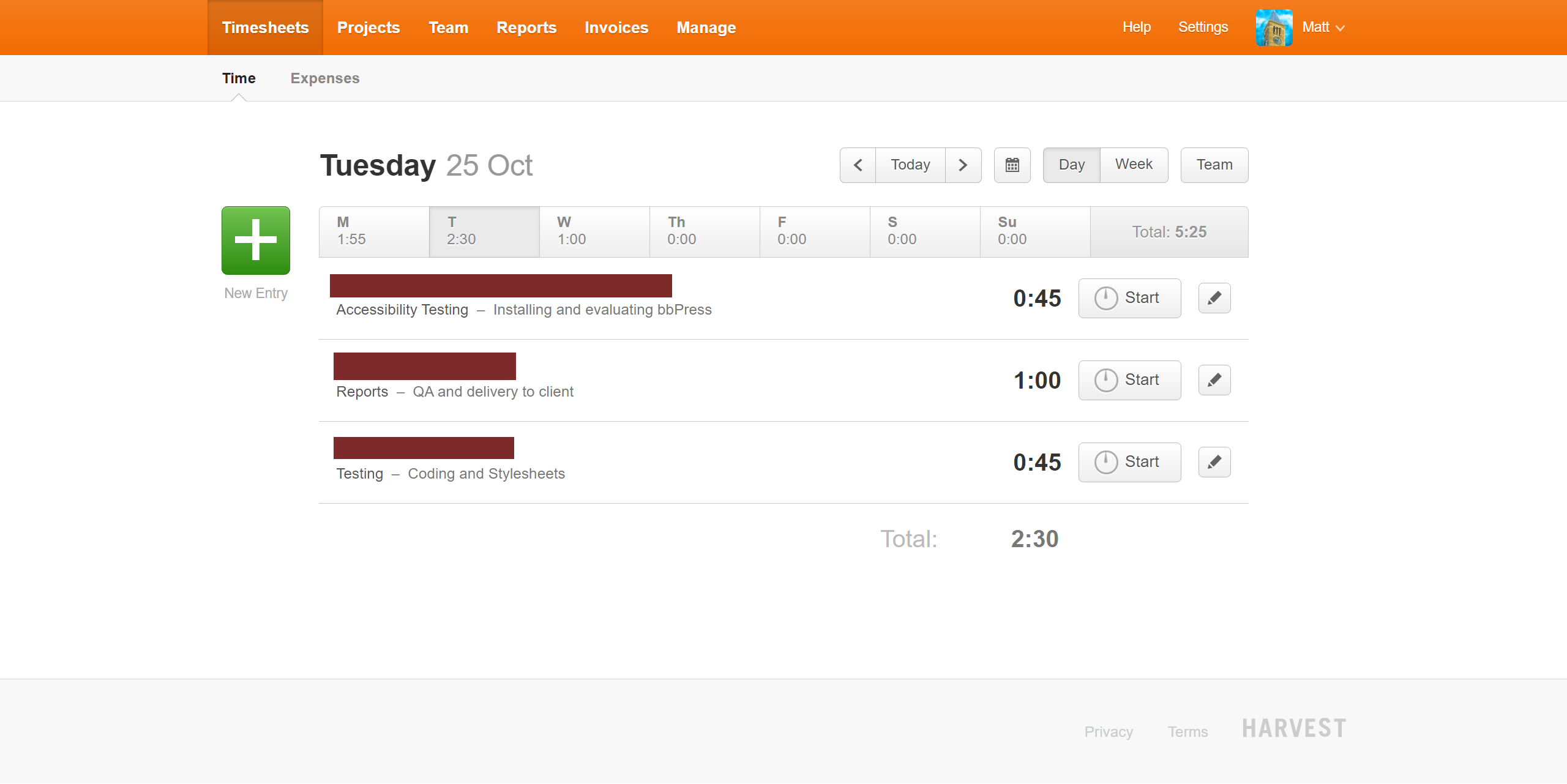
To add a new time entry to this page, the user clicks the large green "plus" button on the left, and then this dialog opens:
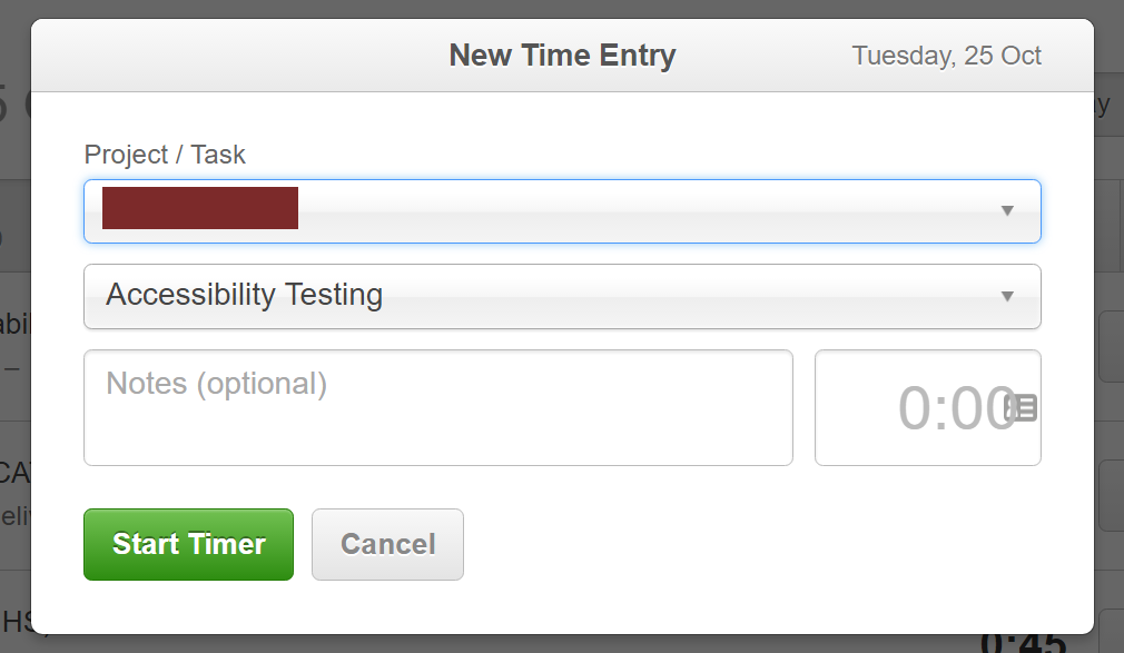
The first and second fields are combinations of a text entry field and a select/dropdown. The user can either open up the dropdown and select from the list of items presented, or start typing to search through the list.
The first box is for the project. Projects are broken down by client. Client names aren't selectable and are presented as bold text.
The second box is for the specific task within the selected project. The contents of the dropdown here change when the project is selected.
Below this is a free-form text field for any notes, and finally a small field for the period of time spent on the task. This can be specified in a couple of formats, either "hours:minutes" or in decimal hours. For example if you spent half an hour on a task you could enter that time as either "0:30" or "0.5".
If that box is left empty then the task timer is started. This adds additional controls on the main page for starting, stopping or pausing the timer.
Overall for a sighted user it's quite a pleasant experience to use Harvest. It's a shame it's so terrible for the blind!
The Harvest iPhone App
At the bottom of the screen, once signed in, there are four tabs: time, expenses, accounts, an unlabeled tab, and a plus button. Double tapping the unlabeled tab puts the focus on the plus button, which I will explain later.
When moving around the screen of the Time tab, there are a number of unlabeled buttons, and the layout of the screen looks different depending on how the screen is navigated. Flicking left and right through the options shows unlabeled buttons, and the initials of days of the week. VoiceOver is slow to respond, and the current date displayed always seems to be changing. When Harvest was first opened, September 9 was showing at the top left of the screen, but after having moved around the app, it then displayed October 12.
Moving around the screen by dragging a finger rather than swiping also yields different results. The tabs at the bottom of the screen are read, but clicking sounds are heard when navigating most of the screen, indicating blank space. At the center of the screen is a piece of advice from Charlie Chaplain, telling me that “a day without laughter is a day wasted” – good to remember when you’re feeling downhearted about the inaccessibility of the world.
At the top left of the screen, October 12 is again shown as the date. Moving right, VoiceOver says “09”, and “bar button actions icon”. However, there are also some inconsistencies in the way in which information is presented.
The focus was moved away from Harvest when I received a phone call. After hanging up and looking at the screen again, Mother Theresa was now offering me some words of wisdom, the date had again returned to September 9, and the unlabeled buttons and initials of weekdays were being read.
The Bar Button Actions Icon, mentioned above, displays the project names and the amount of time recorded in my test entry. Flicking right, VoiceOver says “DayEntryCellPlayIcon”, which, when tapped, takes me back to the main screen.
When pressing the plus button at the bottom right of the main screen, the individual projects are shown. Harvest asks the user to choose a project, and there is also a search function. I double-tapped Office, and then Harvest asked me to choose a task. My options were Itinerary or Misc. I chose the latter, and was then put in a New Time Entry screen. So, it seems that this is how a time entry is created for a specific task using the iPhone, something which is far more accessible with the app than the website.
At this point, I wouldn’t recommend one Harvest app over another. Both the website and the app have idiosyncrasies, and a number of features that are inaccessible. Depending on what I need to do, it may be a matter of switching between the two until further improvements are made.
Add new comment